In-house Work (2016-2018)
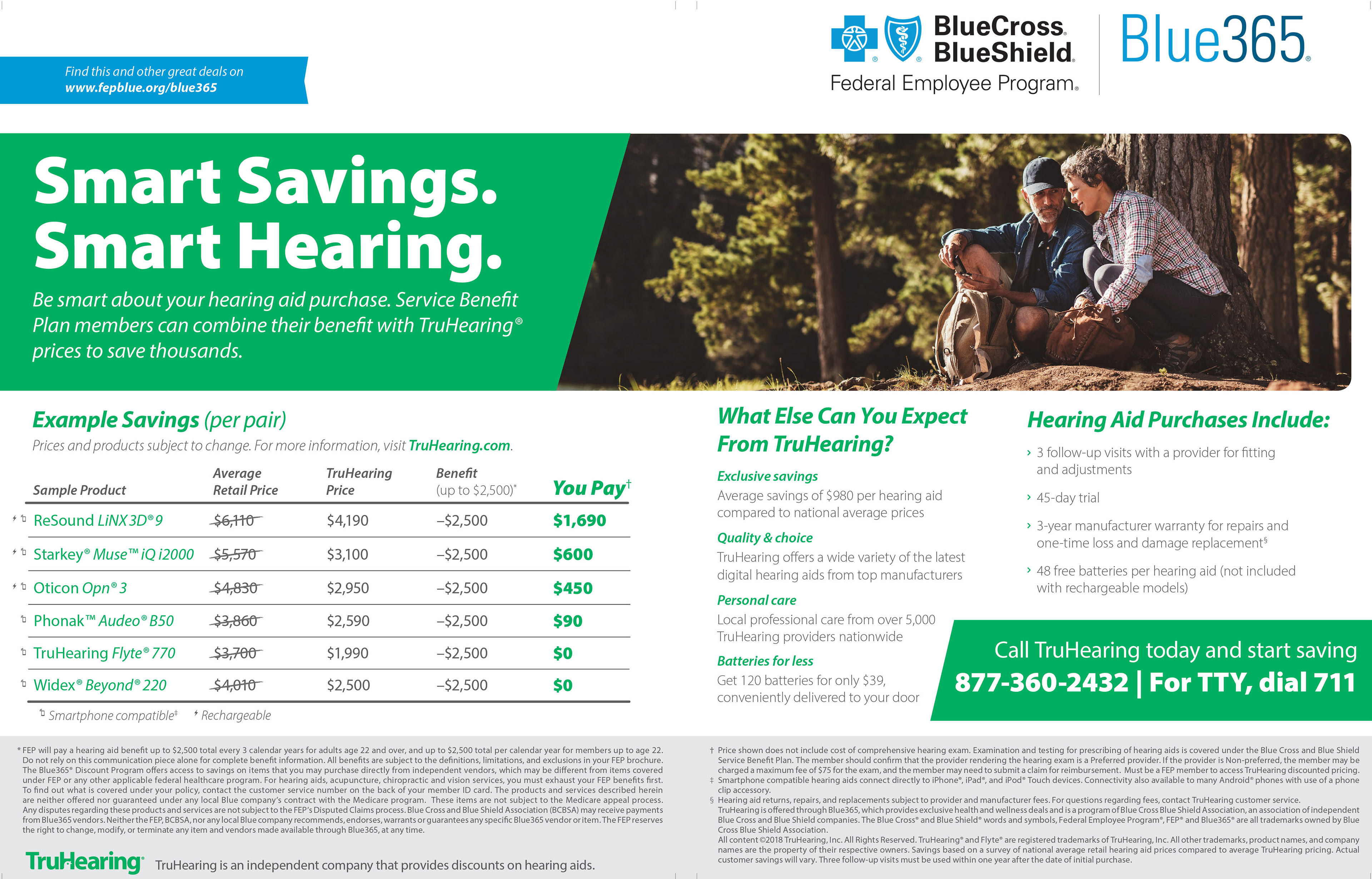
This was an ad for a monthly magazine that I was tasked with redesigning because the previous version had been in circulation for some time. There was a need for updated information, new imagery, solving spacial issues to accommodate more disclaimer copy; while still maintaining compliance standards for ads of this nature. The result was an ad that made better use of the space, felt more full and engaging, and met the needs of the health plan as well.
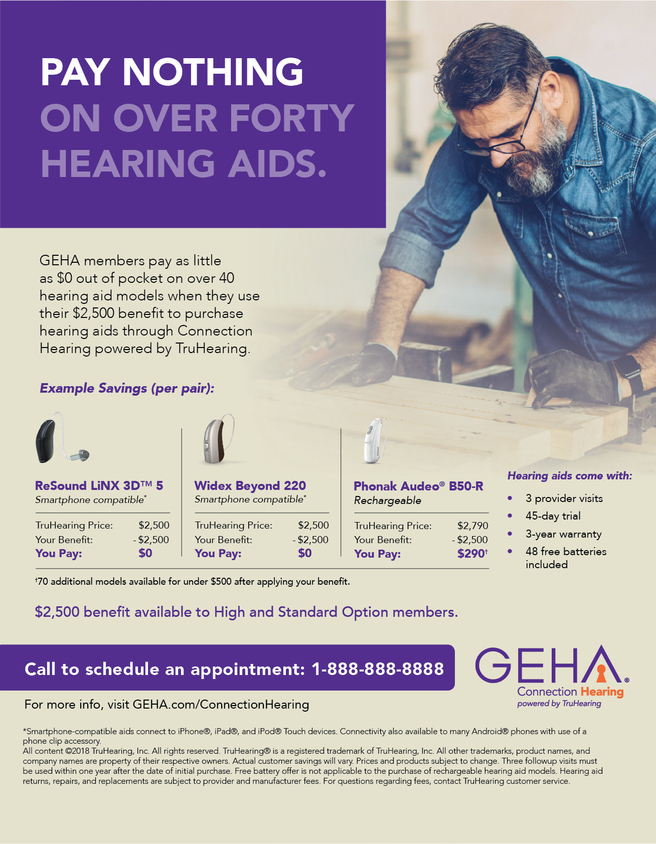
We had the opportunity to have a one page ad with another one of our partners in the same magazine mentioned before. In this ad, we wanted to reach a particular demographic of working people that may have experienced hearing loss before an advanced age. There were a number of inclusions that needed to be mentioned, while keeping each in the proper hierarchy. Thus, this was a useful exercise in arranging copy in a way that met all of our goals and those of our partner.


One of the key parts of this position was creating materials for large, nationwide health plans. These plans had very specific standards for how information is to be presented, in order to meet compliance requirements. In addition, it was essential to become familiar with the brand identity of these plans, the target audience they are trying to reach, and then implement their style guide within the confines of compliance. This meant specifications for level of contrast, font size, imagery, displaying of disclaimers and footnotes, and up-to-date information.
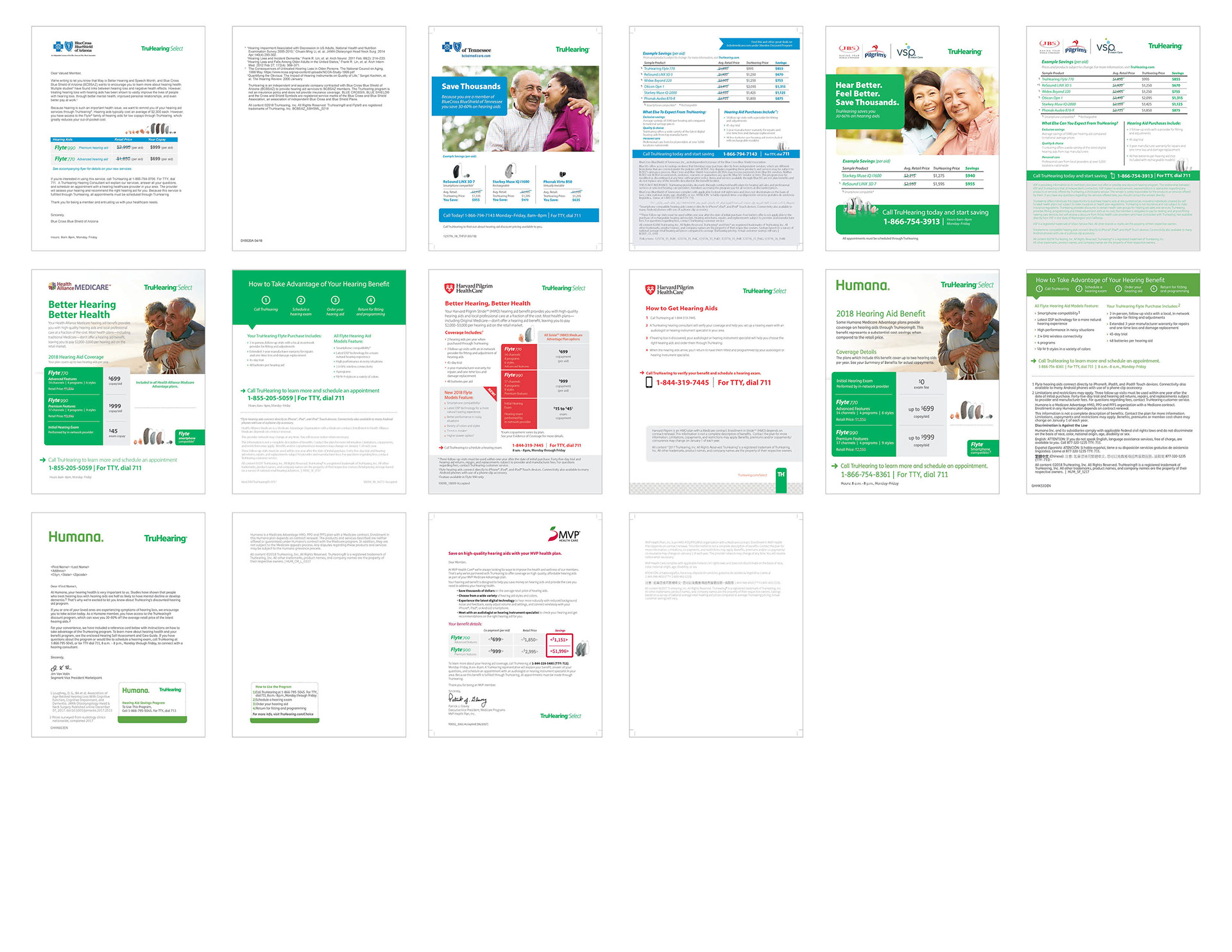
Displayed above is a variety of different flyers and letters we designed for a few of our partners. While much of our work started from templates, my task was to implement the changes specific to the health plan we were working with. This meant communicating with the client to meet their needs, becoming familiar with their brand standards, and maintaining our own brand identity while working on a cobranded piece.
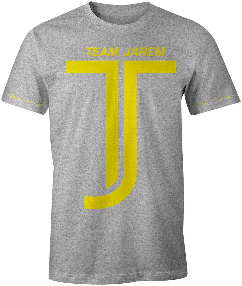
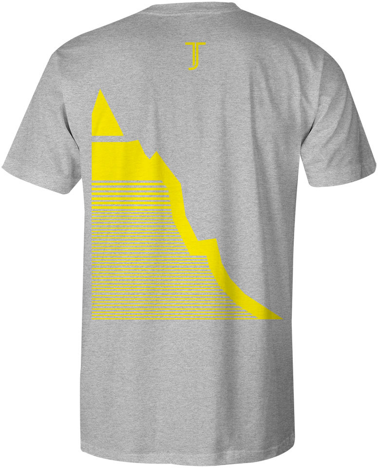
For this project, I was given the opportunity to design a logo in support of one of our employees that was diagnosed with cancer. Our company was going to participate in a bike race whose proceeds went to cancer research. This shirt was serve as the team jersey for our company. There is symbolism in the colors, use of line, the mountain, and the numbering in the lines.
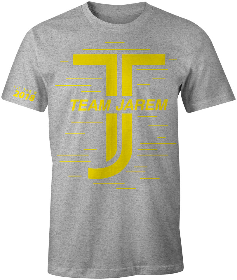

The second version of the jersey was an update for 2018. New lines were added to both further the concept of everyone's participation, and also signify more challenges that our friend had overcome.
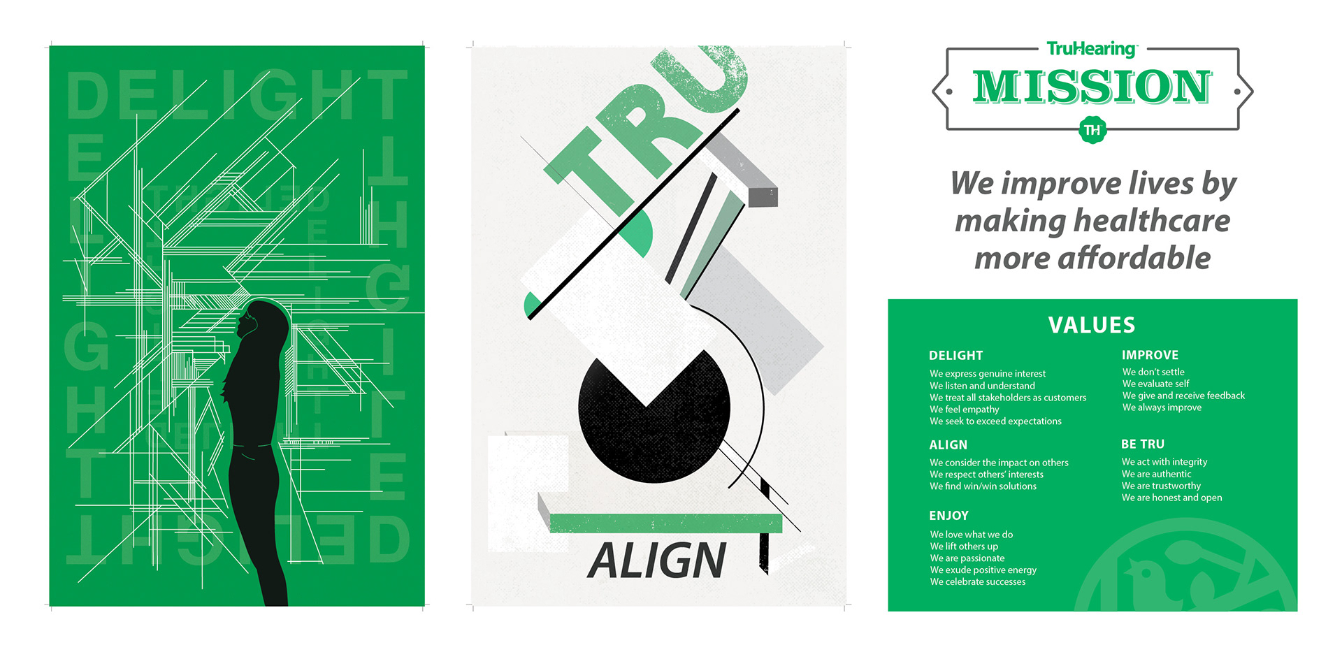
Our company wanted to display our values while also putting more art up around the office. Our design team created a number of values based posters, the first two posters are my contributions. The third was my assignment to display all the values and the secondary principles that go with them.